As our digital product evolved, design and development efforts became increasingly fragmented. Inconsistencies in components, styling, and UX patterns led to slower delivery times, visual clutter, and repeated work across teams. With multiple designers and developers collaborating on a growing system, the need for a unified, scalable, and accessible design language became urgent.
Challenges Identified
Visual and functional inconsistencies across screens
Duplicate or redundant UI components
Lack of clear documentation or guidelines
Increased developer overhead in translating designs into code
Difficulty maintaining accessibility and responsiveness
Process & Approach
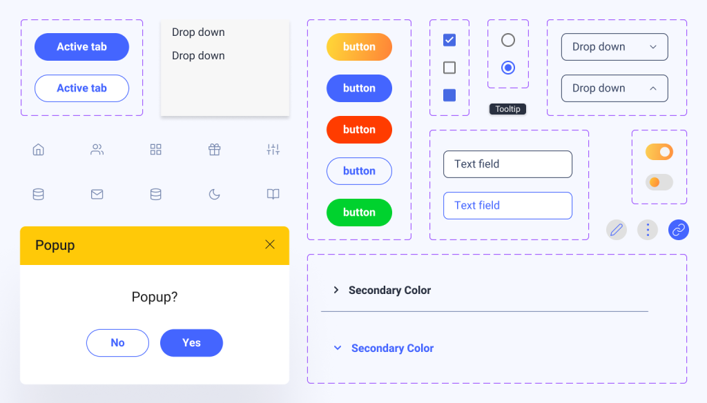
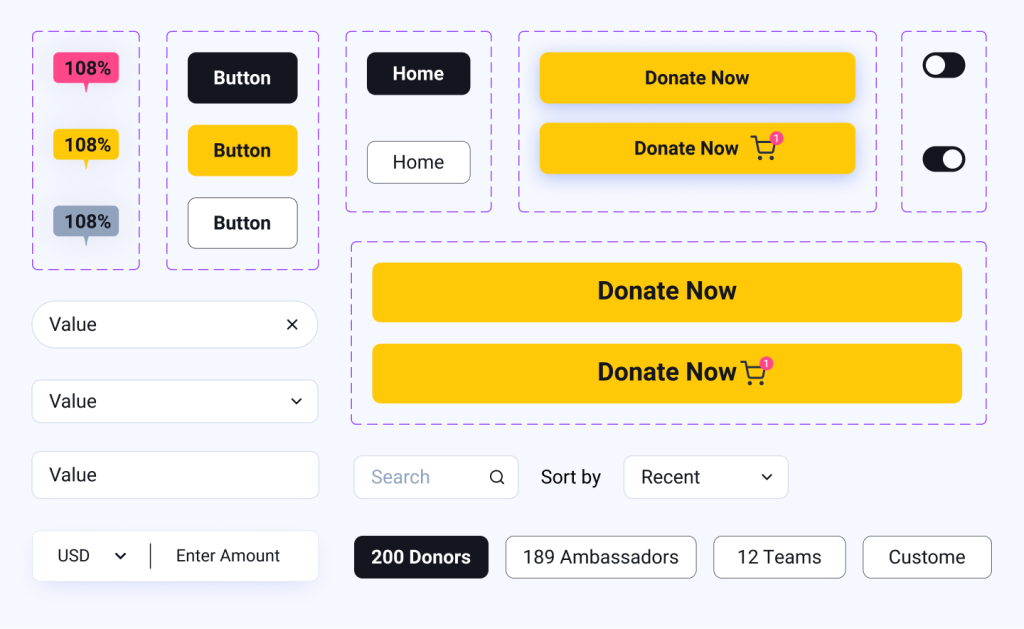
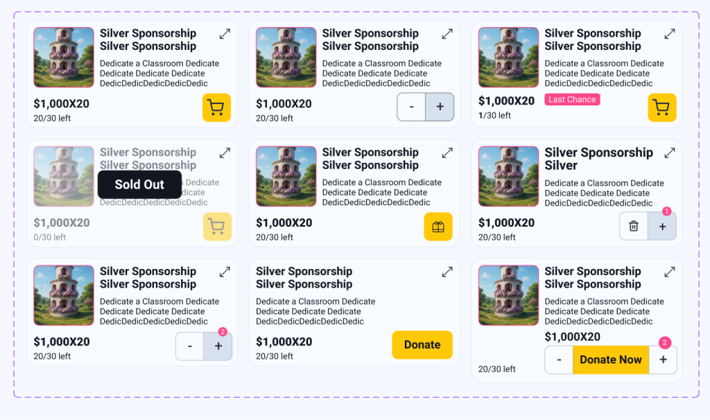
Component Inventory & Audit
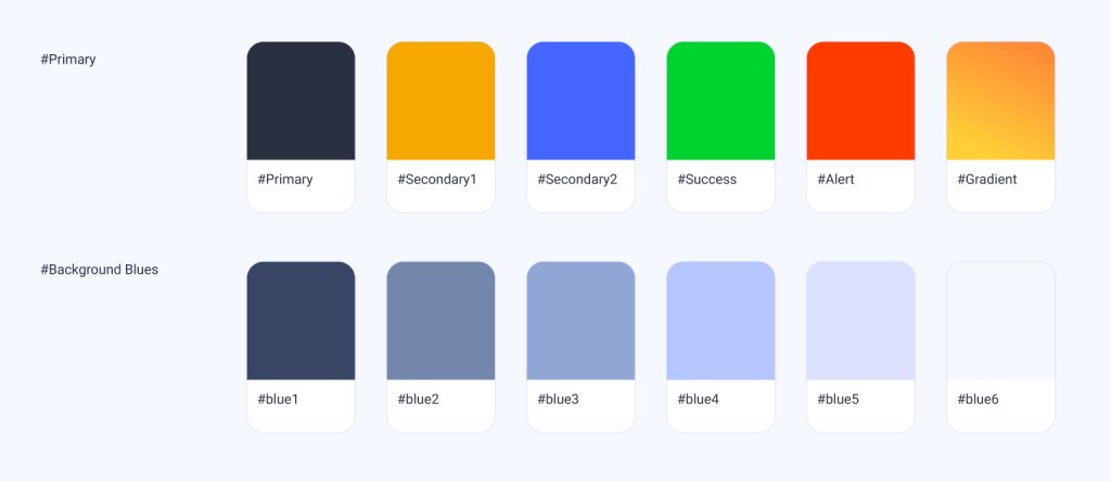
We began by mapping out all existing UI elements in the current product. This included buttons, inputs, modals, navigation elements, cards, and more. Every variation was cataloged and reviewed for overlap, inconsistency, and purpose.
Filtering & Rationalization
We analyzed each component’s usage frequency, design quality, and user impact. Redundant components were merged, and unnecessary variants were removed. This phase allowed us to define a lean, purposeful set of core elements.
Implementation & Adoption
Gradual migration plans were created to replace legacy UI with new system components. Teams received onboarding materials and training to ensure alignment.
Outcome
The new design system brought clarity, speed, and consistency across the product. Designers and developers now speak the same visual language, new screens are built in a fraction of the time, and the user experience is cleaner, more modern, and accessible by default.